Bootstrap is undoubtedly very demanding mobile ready web development framework that helps developers build professional responsive website. This list of Bootstrap Interview Questions will help to grasp the technology easily as it contains lots of practical real-world examples with source code. These Bootstrap Frequently Asked Questions list is designed in a way that it takes reader from beginner level to more advanced questions in a flow.
Soon you will be able to get Bootstrap Interview Questions and Answers PDF here.
If you are further interested to see more practical implementations using Bootstrap, read the below ones also.
- Hybrid Mobile Application Development with PhoneGap, AngularJS and Bootstrap
- Step by Step using Bootstrap3 with ASP.NET MVC5
- Why Bootstrap? A Handy Guide for Beginners
- Learn Bootstrap Development by Building 10 Real-World Projects
Bootstrap Interview Questions List
- What is Bootstrap? What are the core features of Bootstrap? Why to use bootstrap for building websites.
- How and where to get Bootstrap? What does bootstrap package includes?
- What are responsive websites? Explain steps to create a simple webpage using bootstrap?
- What are the key components of Bootstrap? Explain with a diagram.
- What is Bootstrap Grid System? What are the different types of layouts available in Bootstrap? Please briefly explain each of them.
- What are containers in Bootstrap? Kindly explain the concept with the help of examples.
- Briefly explain Progress Bar in Bootstrap? How to create a basic progress Bar in Bootstrap? What contextual classes used with Progress Bar? Explain with example.
- Explain the Responsive Utility Classes in Bootstrap? Give appropriate example with source code to demonstrate visibility on different devices screen size?
- How to create forms using Bootstrap? Briefly explain each form CSS class in bootstrap. Give an example of using each to generate forms.
- What are the different Bootstrap Components including Navbar, Breadcrum, Badges, Jumbotron etc.? Explain briefly each of them.
- How to create a dropdown menu in Bootstrap? Kindly give an example with complete source code?
- What is a bootstrap list group? And why to use it? Kindly explain it’s use with the help of an example.
- How to create a menu using navbar-inverse in Bootstrap?
- How to make an image responsive in Bootstrap? Kindly explain with code sample?
- Kindly explain the following bootstrap plugins?
Modal, Scrollspy, Affix, Transition
What is Bootstrap? What are the core features of Bootstrap? Why to use bootstrap for building websites.
Bootstrap is collection of compiled CSS files (less), HTML files, Typography (type of art work) and some supporting JavaScript files which is use to design modern websites. It act like a framework for front-end development of modern web application. It is open-source framework originally develop by Mark Otto and Jacob Thornton at Twitter.
Following are the core features of Boostrap:
- Through it we can design responsive web page that is a single page work for all type display device (PC, Tablet or Mobile) and with different resolution.
- With Boostrap framework, get out of box many built-in component such as Dropdowns, Styled Button, Navigation bar, breadcrumbs, Labels & Badges, alerts, Progress bar, etc. which help us to design responsive web site.
- It allow us to build page with grid system that divides page space equally which scale up to 12 columns.
- As a part of Framework, we get lots of JavaScript plugins through we can achieve most common tasks such as sliders, tabs, accordions, modal windows, etc. can be build more easily rather than integrating third party plugins.
- As it is an open source framework, so we can customized the core component as we need without considering about license.
- Also this framework is well documented, describing every component and their example use are well written at their official site.
- Bootstrap components can be integrated with other related components as it allows us to modify source code.
We should use bootstrap to build web page because of the above key reasons as well as it saves time and give a consistent look to our web page as compared to other web pages available on the internet. Through bootstrap one can design a web page as professional web pages designer without having too much knowledge about page design. A back-end developer can say himself as full stack developer with having knowledge of bootstrap because it’s allow him to develop complete web application (back-end as well as front-end) without the help of web page designer and as a result a development cost is reduced. Also now bootstrap have large community support all around the world so whenever we face problems regarding bootstrap, we can easily find solutions.
How and where to get Bootstrap? And what does bootstrap package includes?
We can get Bootstrap from their official site which is http://getbootstrap.com/, from this site you will see the Download Bootstrap button, after clicking the button you will get another page which is actually download page contains three Download Bootstrap button which might be shown as below:
To use Bootstrap we just click the first Download Bootstrap button which contains compiled and minified CSS, JavaScript, and fonts but no document and source code files are included.
After clicking the first button we will get a zip file (package) which contains following files and their folder structure are shown below:
Under the bootstrap folder there are three folder css, js, and fonts. The css folder contains all the style sheets; js folder has two JavaScript files which contains all supporting scripts that are needed to include in a page when we use certain bootstrap components such as navigation bar, breadcrumbs etc. to work. The last fonts folder contains all the fonts from glyphicons are included.
What are responsive websites? Explain steps to create a simple webpage using bootstrap?
Responsive websites are those that maintain their look and feel and remain consistent across different display device with different pixel resolution. For example if we design a responsive web page for desktop PC which usually have large display device (as compared to mobile or tablet), then that page can be seen almost perfectly for all type of desktop monitors with different resolution; as well as this page maintains a consistent look of its component in other type of display devices such as mobile, tablet, smart TV etc. That responsive website adjust its layout base on screen size and pixel resolution.
Graphically represent this idea as:
As seen from the above diagram the responsive web page maintains a consistence look across all type of devices, it also called mobile first approach.
Steps to create a simple web page using bootstrap are as follows:
Include the Content Delivery Network (CDN) provider link of bootstrap in web page; or get the bootstrap package from http://getbootstrap.com/ and then include main bootstrap.css or bootstrap.min.css stylesheet file into the web page (html) though <link> element of html; then we can use various CSS classes of bootstrap; to build a simple responsive web page. But if we want to use specific css class such as navigation bar, breadcrumbs; then we also have to include the supporting JavaScript files link to the web page that come with the package or add related CDN link.
For example following is the simple html code (User information Input form) that build as a responsive web page using bootstrap:
<!DOCTYPE html>
<html lang="en">
<head>
    <title>Simple Responsive page for Large screen display</title>
    <link rel="stylesheet" href="https://maxcdn.bootstrapcdn.com/bootstrap/3.3.7/css/bootstrap.min.css">
</head>
    <body>
        <div class="container-fluid">
            <h1>Simple Responsive page for large screen display</h1>
            <form>
                <div class="form-group">
                    <div class="col-lg-12">
                        <div class="row">
                            <div class="col-lg-3">
                               <label for="name" class="control-label">User Name</label>
                               <input id="name" type="text" class="form-control"/>
                            </div>
                            <div class="col-lg-3">
                                <label for="address" class="control-label">Address</label>
                                <input id="address" type="text" class="form-control"/>
                            </div>
                            <div class="col-lg-3">
                                <label for="nationalId" class="control-label">National ID</label>
                                <input id="nationalId" type="text" class="form-control"/>
                            </div>
                            <div class="col-lg-3">
                                <label for="income" class="control-label">Income</label>
                                <input id="income" type="text" class="form-control"/>
                            </div>
                        </div>
                        <div class="row">
                            <div class="col-lg-3">
                                <button type="submit" class="btn btn-primary" style="margin-top: 5px;">Submit</button>
                            </div>
                        </div>
                    </div>
                </div>
            </form>
        </div>
    </body>
</html>
As seen from the code here, we use CDN link to include bootstrap.min.css file; then we use fluid layout container to build the form. As Bootstrap Grid System divide the page space into 12 equal columns; here we divide those 12 columns into 4 equal columns as a result each column contains space of 3 columns; also here we put first 12 column into a <div> element which contains bootstrap row class and we put each label and input element into a <div> element which contains bootstrap class col-lg-3. Actually through col-lg-3 class we divide page space and align the html content. Through this col-lg-* class we mainly represent this page for large display device having width pixel ≥992px.
We are going to discuss in detail about Bootstrap Grid System and Layouts in Bootstrap in next couple of questions, so don’t worry if you are not 100% clear about those concepts right now. You will get details about Grid System and Layouts with more practical examples later in this bootstrap interview questions series.
If we run this page in a PC monitor we will get the following view:

We get view as we expected. But if we run this page in a small display device having width pixel less then 992px or reduce width of browser window we will get the following view:

Here we see how bootstrap align our elements vertically to make the page responsive. Because of using the fluid container; each element of page always stress to edge of display device. To make the page stylish we use different CSS classes to different HTML elements. For example label have control-label class, input have form-control class and submit button have btn btn-primary class.
If we run this page into a more small display device or more reduce width of browser window we will get the following view:
As we see this page still maintains its elements alignment in small display and we can interact with the page element without any hassle. This is the main benefit of using bootstrap which help us to build responsive page.
What are the key components of Bootstrap? Explain with a diagram.
Key components of Bootstrap are:
- HTML5 doctype.
- CSS file contains media queries (support grid system).
- Supporting JavaScript file (for building dynamic components).
- Supporting fonts and glyphicons for making our pages stylish.
Below is the graphical representation of building block of Bootstrap: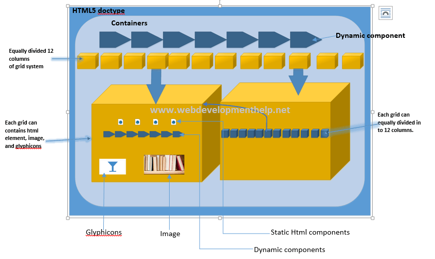
As seen from the above diagram bootstrap use the HTML5 components to apply its CSS classes. As seen second layer of the diagram contains Containers (fixed or fluid) which is a special CSS class that house all other HTML components and it also help us to align component with help of other CSS class of bootstrap.
The Container contains divide whole page into 12 equal columns (with the help of CSS file that come with framework) where the each column can contains various component of HTML (Static or dynamic) as well as Glyphicons and images.
As seen from the diagram of (right-side) we can also divide a single grid into 12 equal columns, where each column can provide same functionality as left-side column; through this process we can build hierarchy of columns to our required level. In order to build dynamic components of bootstrap, we must have to use the JavaScript file that is shipped with the framework; and there are also out-of-box Fonts and Glyphicons that helps us to make our web site more stylish.
What is Bootstrap Grid System? What are the different types of layouts available in Bootstrap? Please briefly explain each of them with example.
Grid system of bootstrap is the way in which it divide the available page space into equally 12 columns. We can even divide a single column into equal 12 column. That is how we create columns as many as we want but, we have to follow the rule number_of_columns X column_span=12. Graphically we can represent the idea as follow:
In Bootstrap there are mainly two types of layout:
- Fixed-Layout, and
- Fluid-layout.
Fixed-Layout in Bootstrap:
In bootstrap we implement fixed layout by using the .container class. Through this CSS, we can assign fixed number of pixels for HTML element with the help of its child CSS classes such .col-xs-*, .col-sm-*, .col-md-*, .col-lg-*, .col-xl-*. These classes are used to define column width of Bootstrap Grid System. Here (*) represent any number in between 1 to 12.
For example class .col-lg-12 represent 12 columns of grid with number of width pixel in between ≥992px and <1200px; although this layout system allows us to increase or decrease pixel number within certain range so the layout still show responsiveness at certain pixel number range; which is known as breakpoint that set by media query. That is fixed numbered pixel range specify the width of a column.
The main reason why we call as fixed-layout, because this container does not set its column pixel value in percentage and also placing its content from the middle of available width space and leave some extra space that look like margin of the page.
Fluid-Layout in Bootstrap:
We implement fluid layout by using .container-fluid class. Space allocation principle for a column is same as fixed layout but this container assign its column pixel value with percentage and use full available page space. Also media queries use percent value to calculate its breakpoint value and this layout stress its element to each edge of it view and leave no extra space that is use 100% of width space of display system.
For example consider the following which contains both fixed-layout as well as fluid-layout form:
<!DOCTYPE html>
<html lang="en">
<head>
    <title>Simple Responsive page for Large screen display</title>
    <link rel="stylesheet" href="https://maxcdn.bootstrapcdn.com/bootstrap/3.3.7/css/bootstrap.min.css">
</head>
    <body>
        <div class="container">
            <h1>Fixed layout Form</h1>
            <form>
                <div class="form-group">
                    <div class="col-lg-12">
                        <div class="row">
                            <div class="col-lg-3">
                               <label for="name" class="control-label">User Name</label>
                               <input id="name" type="text" class="form-control"/>
                            </div>
                            <div class="col-lg-3">
                                <label for="address" class="control-label">Address</label>
                                <input id="address" type="text" class="form-control"/>
                            </div>
                            <div class="col-lg-3">
                                <label for="nationalId" class="control-label">National ID</label>
                                <input id="nationalId" type="text" class="form-control"/>
                            </div>
                            <div class="col-lg-3">
                                <label for="income" class="control-label">Income</label>
                                <input id="income" type="text" class="form-control"/>
                            </div>
                        </div>
                        <div class="row">
                            <div class="col-lg-3">
                                <button type="submit" class="btn btn-primary" style="margin-top: 5px;">Submit</button>
                            </div>
                        </div>
                    </div>
                </div>
            </form>
        </div>

        <hr>
        <div class="container-fluid">
            <h1>Fluid layout Form</h1>
            <form>
                <div class="form-group">
                    <div class="col-lg-12">
                        <div class="row">
                            <div class="col-lg-3">
                                <label for="name" class="control-label">User Name</label>
                                <input id="name" type="text" class="form-control"/>
                            </div>
                            <div class="col-lg-3">
                                <label for="address" class="control-label">Address</label>
                                <input id="address" type="text" class="form-control"/>
                            </div>
                            <div class="col-lg-3">
                                <label for="nationalId" class="control-label">National ID</label>
                                <input id="nationalId" type="text" class="form-control"/>
                            </div>
                            <div class="col-lg-3">
                                <label for="income" class="control-label">Income</label>
                                <input id="income" type="text" class="form-control"/>
                            </div>
                        </div>
                        <div class="row">
                            <div class="col-lg-3">
                                <button type="submit" class="btn btn-primary" style="margin-top: 5px;">Submit</button>
                            </div>
                        </div>
                    </div>
                </div>
            </form>
        </div>
    </body>
</html>
If we run this page into the browser which have large pixel resolution display monitor we will have the following view:
As seen from the above screen the fixed layout’s container left certain amount of display space, of both edge of the screen. This layout does not utilized full (100%) of the display space. But in the case of fluid layout container full (100%) of display space is used to align its contents.
Now if we reduce the browser window width at certain amount to near about medium screen display then we have following screen display:
Medium screen display:
As seen both layout resize it contents to make page responsive but still now fixed layout left some amount of space; both edge of the screen.
If we further reduce the browser window size near to small screen then will have the following Small screen display output:
In this case both layout utilized full space of the display device. So that the page still responsive.
Back to Top
What is container in Bootstrap? Kindly explain the concept with the help of examples.
In bootstrap container is a special class that allocate display device space and house all HTML elements and their supporting CSS classes to align HTML contents; and make page responsive. Through containers bootstrap implement its Grid Layout System. There are mainly two type of containers class in bootstrap .container class and .container-fluid class. The .container class allocate display space in fixed numbered pixel whereas .container-fluid class allocate display space in percentage (%). In container we mainly use two type of classes a) .row b) .col-*. Through row class we define a row and then we define column into the row; of bootstrap grid system, through .col-* class.
For example consider the following HTML code:
<!DOCTYPE html>
<html lang="en">
<head>
    <title>Simple Responsive page for Large screen display</title>
    <link rel="stylesheet" href="https://maxcdn.bootstrapcdn.com/bootstrap/3.3.7/css/bootstrap.min.css">

</head>
<body>
<div class="container-fluid">
    <h1>Simple Responsive page for large screen display</h1>
    <form>
        <div class="form-group">
            <div class="col-lg-12">
                <div class="row">
                    <div class="col-lg-3">
                        <label for="name" class="control-label">User Name</label>
                        <input id="name" type="text" class="form-control"/>
                    </div>
                    <div class="col-lg-3">
                        <label for="address" class="control-label">Address</label>
                        <input id="address" type="text" class="form-control"/>
                    </div>
                    <div class="col-lg-3">
                        <label for="nationalId" class="control-label">National ID</label>
                        <input id="nationalId" type="text" class="form-control"/>
                    </div>
                    <div class="col-lg-3">
                        <label for="income" class="control-label">Income</label>
                        <input id="income" type="text" class="form-control"/>
                    </div>
                </div>
                <div class="row">
                    <div class="col-lg-3">
                        <button type="submit" class="btn btn-primary" style="margin-top: 5px">Submit</button>
                    </div>
                </div>
            </div>
        </div>
    </form>
</div>

</body>
</html>
If we run this code in browser we will find the following output:

From the output we see the .container-fluid class (container) utilized the full available space of the display device. Here we define two row with the help of .row class. In the first row we place four HTML input element along with label element. Each pair of element are define under a <div> element which contains col-lg-3 class as a result each pair of element of the first row occupy 25% space of the display device. In the second row we define only one element the submit button under .col-lg-3 class.
If we just change the container to .container of the above code then we will have the following output:
As we seen from the output this container does not use full space of the display device also place its content from the center; arrow show the unused space of both edge. Another important think about this container is that, this container allow its child CSS to have fix numbered, in this each case col-lg-3 class will have fix numbered pixel space that determine by media query of the bootstrap.
Briefly explain Progress Bar in Bootstrap? How to create a basic progress Bar in Bootstrap? What contextual classes used with Progress Bar? Explain with example.
Progress bar in bootstrap is just more stylized HTML5 <progress> element. That is in bootstrap, we just use core HTML5 <progress> element with bootstrap’s special CSS classes; that specifically made for <progress> element.
To create a basic progress bar in bootstrap, we need two things, a <div> element and the <progress> element; with <div> element we define the caption text and show the progress percent; and behind the screen <progress> element do the actual work; we link up <div> element with <progress> element by the help of aria-described attribute of <progress> element. That is <div> element’s id value and aria-described attribute’s value must be same.
For example the following code show how to create a basic progress bar in bootstrap:
<!DOCTYPE html>
<html lang="en">
<head>
    <title>Simple bootstrap progress bar</title>
    <link rel="stylesheet" href="https://maxcdn.bootstrapcdn.com/bootstrap/4.0.0-alpha.5/css/bootstrap.min.css">
</head>
<body>
    <div class="container">
        <div id="linkId1" class="col-lg-12">Works in progress... 0%</div>
        <progress class="progress" value="0" max="100" aria-describedby="linkId"></progress>

        <div id="linkId2" class="col-lg-12">Works in progress... 45%</div>
        <progress class="progress" value="45" max="100" aria-describedby="linkId2"></progress>

        <div id="link3" class="col-lg-12">Works in progress... 80%</div>
        <progress class="progress" value="80" max="100" aria-describedby="link3"></progress>
    </div>
</body>
</html>
If we run this code in browser we will have the following output: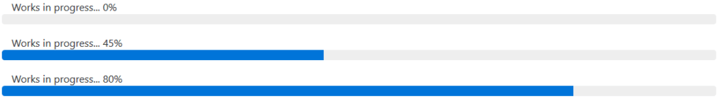
As seen from the output the value attribute of first progress bar is set to 0; so no progress is shown and we link the <div> and <progress> element through linkId1. Similarly we link second and third <div> and <progress> element through linkId2 and linkId3 respectively. Because of value attribute the second progress bar represent 45% progress graphically; similarly third progress bar represent 80% progress graphically.
The following contextual classes can be used with progress bar: progress-success, progress-info, progress-warning, and progress-danger.
That is though contextual class we can apply some extra styling effect to the progress bar and it does not required extra <div> element.
For example consider the following code:
<!DOCTYPE html>
<html lang="en">
<head>
    <title>Simple bootstrap progress bar</title>
    <link rel="stylesheet" href="https://maxcdn.bootstrapcdn.com/bootstrap/4.0.0-alpha.5/css/bootstrap.min.css">
</head>
<body>
    <div class="container" style="margin-top: 5%">
        <h1>Contextual classes used with Progress Bar</h1>
        <br>
        <div class="col-lg-12">
            <progress class="progress progress-success" value="5" max="100"></progress>
        </div>
        <div class="col-lg-12">
            <progress class="progress progress-info" value="45" max="100"></progress>
        </div>
        <div class="col-lg-12">
            <progress class="progress progress-warning" value="85" max="100"></progress>
        </div>
        <div class="col-lg-12">
            <progress class="progress progress-danger" value="100" max="100"></progress>
        </div>
    </div>
</body>
</html>
If we run this code we will have the following output: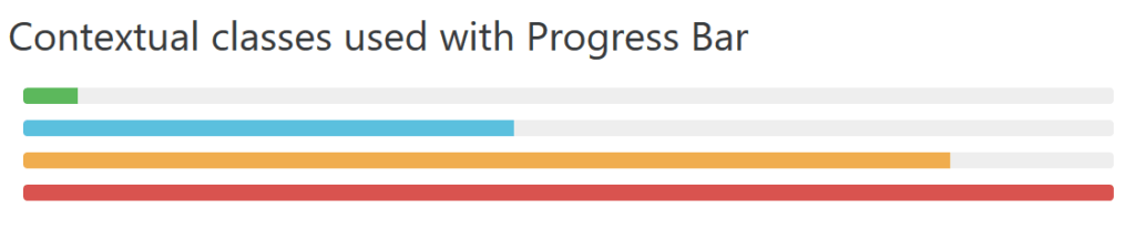
As seen from the output those extra contextual classes are used to maintain consistent look with other bootstrap’s class style.
Explain the Responsive Utility Classes in Bootstrap? Give appropriate example with source code to demonstrate visibility on different devices screen size?
In bootstrap, Responsive utility classes are set of special classes whose sole purpose is to hide or display HTML elements base on screen resolution that determine by media query of bootstrap. For example the .hidden-md-down hide an element if the screen resolution is extra small (<544px), small (≥544px – <768px) and medium (≥768px – <992px); and show only on large (≥992px – <1200px) and extra-large (≥1200px) display device.
For example consider the following code:
<!DOCTYPE html> <html lang="en"> <head> <title>Example of Bootstrap Responsive Utility Class </title> <link rel="stylesheet" href="https://maxcdn.bootstrapcdn.com/bootstrap/4.0.0-alpha.5/css/bootstrap.min.css"> <link rel="stylesheet" href="https://maxcdn.bootstrapcdn.com/bootstrap/3.3.7/css/bootstrap.min.css"> </head> <body> <div class = "container-fluid" style = "padding: 5%"> <h2>Bootstrap Responsive Utility Class </h2> <br> <div class = "col-xs-12 col-sm-3"> <span class = "hidden-xs"><p class="bg-primary">Screen is not in extra small pixel range <544px)</p></span> <span class = "visible-xs"><p class="bg-info">Screen size is now in very small pixel range (≥544px - <768px)</p></span> </div> <div class = "col-xs-12 col-sm-3"> <span class = "hidden-md"><p class="bg-info">Screen size is not in medium pixel range (≥768px - <992px)</p></span> <span class = "visible-md"><p class="bg-primary">Screen size is now in medium pixel range(≥768px - <992px)</p></span> </div> <div class = "col-xs-12 col-sm-3"> <span class = "hidden-lg"><p class="bg-warning">Screen size is not in large pixel range(≥992px - <1200px)</p></span> <span class = "visible-lg"><p class="bg-info">Screen size is now in large pixel range(≥992px - <1200px) </p></span> </div> <div class = "col-xs-12 col-sm-3"> <span class = "hidden-md-down"><p class="bg-danger">Screen size is now in between large and very large pixel range</p></span> </div> </div> </body> </html>
If we run this code in large screen display then we will have the following output:
As seen the at large screen display the first, second and third block show Screen size is not in * pixel range. Here (*) represent any screen size extra small, small and medium. Only last block show the current screen size pixel range; that is the current display device is either within large or very large pixel range. If reduce the browser width in certain amount that equal to medium range display device; then we will have following output:
As now the screen size in both range medium and very large pixel, but not in extra small and large pixel range. As seen, base on screen size bootstrap hide and show corresponding <span> elements. If we further reduce the screen size then we will have the following output:
As seen the extra-large block not showing at all and still the screen is not in any pixel range but out of extra-large pixel range display device. Now if we further reduce the screen size then we will have the following output:
As seen now the screen size fall into very small pixel range display, so visible-xs class work and corresponding <span> is shown. This is how the responsive utility classes are work in bootstrap based screen resolution.
How to create forms using Bootstrap? Briefly explain each form CSS class in bootstrap. Give an example of using each to generate forms.
In the context of bootstrap we create form through form-group class. We apply this class in a <div> and place that <div> element under the <form> element of HTML; and within that <div> element we place our desired other HTML elements to create form. Through bootstrap we can create vertical, horizontal, and inline form. By default every form are vertical because bootstrap apply display: block and width: 100% style to all HTML elements within a form by default.
The following code create a vertical form:
<!DOCTYPE html>
<html lang="en">
<head>
    <title>Example of vertical form</title>
    <link rel="stylesheet" href="https://maxcdn.bootstrapcdn.com/bootstrap/3.3.7/css/bootstrap.min.css">
</head>
<body>
<div class="container-fluid">
    <h1>Vertical Form</h1>
    <form>
        <div class="form-group">
            <label for="name">User Name</label>
            <input id="name" type="text" class="form-control"/>
        </div>
        <div class="form-group">
            <label for="address">Address</label>
            <input id="address" type="text" class="form-control"/>
        </div>
        <div class="form-group">
            <label for="nationalId">National ID</label>
            <input id="nationalId" type="text" class="form-control"/>
        </div>
        <div class="form-group">
            <label for="income">Income</label>
            <input id="income" type="text" class="form-control"/>
        </div>
        <div class="form-group">
            <button type="submit" class="btn btn-primary">Submit</button>
        </div>
    </form>
</div>
</body>
</html>
Here we put each pair of <label> and <input> element under the form-group class. If we run this code in browser we will have the following output:
As we seen the form-group class apply margin around it containing element and also help us to align elements vertically.
To create a horizontal form, first we have to include form-horizontal class to the <form> element; then we put pair of elements such as <label> and <input> under a <div> element that have CSS class form-group. To align elements horizontally; we also have to use the bootstrap grid system; that is, we have to specify the amount of space for each element under the <div class=”form-group”> element, so that they can align them self horizontally. For example consider the following code which represent horizontal form:
<!DOCTYPE html>
<html lang="en">
<head>
    <title>Example of Horizontal form</title>
    <link rel="stylesheet" href="https://maxcdn.bootstrapcdn.com/bootstrap/3.3.7/css/bootstrap.min.css">
</head>
<body>
<div class="container-fluid">
    <h1>Horizontal Form</h1>
    <form class="form-horizontal" >
        <div class="form-group">
            <label for="name" class="control-label col-sm-2">User Name</label>
            <div class="col-sm-10">
                <input id="name" type="text" class="form-control"/>
            </div>
        </div>

        <div class="form-group">
            <label for="address" class="control-label col-sm-2">Address</label>
            <div class="col-sm-10">
                <input id="address" type="text" class="form-control"/>
            </div>
        </div>
        <div class="form-group">
            <label for="nationalId" class="control-label col-sm-2">National ID</label>
            <div class="col-sm-10">
                <input id="nationalId" type="text" class="form-control"/>
            </div>
        </div>
        <div class="form-group">
            <label for="income" class="control-label col-sm-2">Income</label>
            <div class="col-sm-10">
                <input id="income" type="text" class="form-control"/>
            </div>
        </div>
        <div class="col-sm-offset-2 col-sm-10">
            <button type="submit" class="btn btn-primary">Submit</button>
        </div>
    </form>
</div>
</body>
</html>
As seen from the code; for the first pair of elements we specify space for the <label> by using col-sm-2 class; and for <input> element we specify its space by using <div class=”col-sm-10“>; as a result in total we use 12 grid of bootstrap, to align element horizontally. Similarly we do the same thing for all other pair of elements except the last one; because here is only one <button> element and we do not use any <label> element; so we use col-sm-offset-2 class to make offset of 2 grid, so that the button align itself with the above <label> element; then we use col-sm-10 class to use utilized total 12 grid.
If we run the above code then we will have the following output: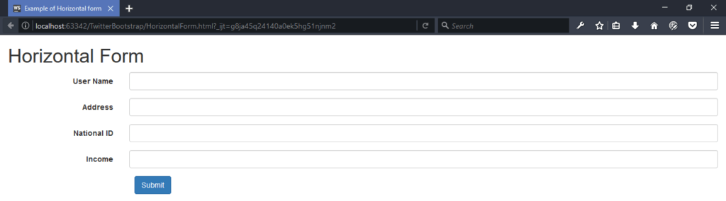
As seen all the form element align them self horizontally.
Finally the inline form; to create inline form we simply just have to use form-inline in <from> element and we will use the same code; that we used in making the vertical form as before. Inline form align its element side by side to form a single horizontal row. For example consider the following code:
<!DOCTYPE html>
<html lang="en">
<head>
    <title>Example of Inline form</title>
    <link rel="stylesheet" href="https://maxcdn.bootstrapcdn.com/bootstrap/3.3.7/css/bootstrap.min.css">
</head>
<body>
<div class="container-fluid">
    <h1>Inline Form</h1>
    <form class="form-inline">
        <div class="form-group">
            <label for="name">User Name</label>
            <input id="name" type="text" class="form-control"/>
        </div>
        <div class="form-group">
            <label for="address">Address</label>
            <input id="address" type="text" class="form-control"/>
        </div>
        <div class="form-group">
            <label for="nationalId">National ID</label>
            <input id="nationalId" type="text" class="form-control"/>
        </div>
        <div class="form-group">
            <label for="income">Income</label>
            <input id="income" type="text" class="form-control"/>
        </div>
        <div class="form-group">
            <button type="submit" class="btn btn-primary">Submit</button>
        </div>
    </form>
</div>
</body>
</html>
As seen from the code all the thing are same as vertical form code; except here we only include form-inline class to <form> element. If we run this code we will have the following output: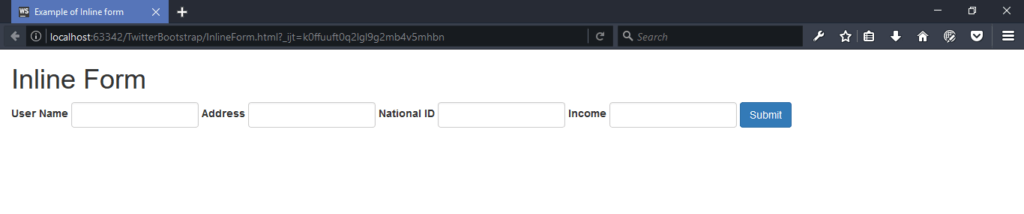
As seen; here all elements are place side by side to make a single row.
What are the different Bootstrap Components including Navbar, Breadcrum, Badges, Jumbotron etc.? Explain briefly each of them.
Bootstrap Navbar:
In bootstrap navbar is a special class that allow us to implement navigation system in web page. It along can do nothing; it work like an abstract class that allow other navigation related classes to implement specific type of navigation such as default navbar, inverse navbar, form navigation etc. The role of navbar is to change its content viewing process base on display device resolution. It may collapses all its content and then view those contents vertically if the display device width is small e.g. mobile device or view its content horizontally if the display device large enough. For example below code represent the default navigation bar.
Content of navbar.html file:
<!DOCTYPE html>
<html lang="en">
<head>
    <meta charset="UTF-8">
    <title>Example of Default Navigation Bar </title>

    <link rel="stylesheet" href="bootstrap.css">
    <script src="jquery.js"></script>
    <script src="bootstrap.js"></script>

</head>
<body>
    <div class="container">
        <div class="navbar navbar-default">
                <div class="navbar-header">
                    <button type="button" class="navbar-toggle" data-toggle="collapse" data-target="#defaultNavBar">
                        <span class="icon-bar"></span>
                        <span class="icon-bar"></span>
                        <span class="icon-bar"></span>
                    </button>
                    <a class="navbar-brand" href="#">Default Navbar</a>
                </div>

                <div class="collapse navbar-collapse" id="defaultNavBar">
                    <ul class="nav navbar-nav">
                        <li class="active"><a href="#">Place holder 1</a></li>
                        <!-- drop down list -->
                        <li class="dropdown">
                            <a href="#" class="dropdown-toggle" data-toggle="dropdown">List place holder <b class="caret"></b></a>
                            <ul class="dropdown-menu">
                                <li><a href="#">List item1</a></li>
                                <li><a href="#">List item2</a></li>
                                <li><a href="#">List item3</a></li>
                                <li class="divider"></li>
                                <li><a href="#">List item4</a></li>
                                <li><a href="#">List item5</a></li>
                            </ul>
                        </li>
                        <li><a href="#">Place holder 2</a></li>
                        <li><a href="#">Place holder 3</a></li>
                        <li><a href="#">Place holder 4</a></li>
                    </ul>
                </div>
        </div>
    </div>
</body>
</html>
[Note: To run this code we must have to put navbar.html, bootstrap.css, jquery.js, bootstrap.js file in same folder.]
As seen from the code navbar serve as an abstract class through it, we implement default navigation bar with the help of navbar-dafault class. Here <div class=”navbar-header”> element contains <button> and <a> element. Then content of <a> element will be shown regardless of display size but the content of <button> will be shown when the display size is small. If the display size large enough then content of <div class=”collapse navbar-collapse” id=”defaultNavBar”> will also be shown. But when the display size is small then <button> element will be shown alongside with the <a> content, but in this case button represent link to the <div class=”collapse navbar-collapse” id=”defaultNavBar”> element’s content. If we run this code in browser then we will get the following output as: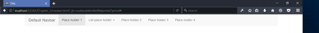
As seen because of large screen all content are displayed except content of <button>. But if we reduce the browser size then we will have the following output:
As seen now <button> are shown and if we click the button then will have the following output:
As seen the <button> element now hold the link of <div class=”collapse navbar-collapse” id=”defaultNavBar”> element’s content. We implement this link through data-target=”#defaultNavBar” attribute of <button> with the id=”defaultNavBar” attribute of the place holder <div> element.
Bootstrap Breadcrum:
It use to represent current point of page navigation, as well as to represent site hierarchy. For example consider the following code:
<!DOCTYPE html>
<html lang="en">
<head>
    <meta charset="UTF-8">
    <title>Example of Breadcrumb</title>

    <link rel="stylesheet" type="text/css" href="bootstrap.css">
</head>
<body>
<div class="container">
    <ol class="breadcrumb">
        <li><a href="#">Page 1</a></li>
        <li><a href="#">Page 2</a></li>
        <li class="active">Page 3</li>
    </ol>
</div>
</body>
</html>
If we run this code then we will have the following output:
As seen here class active represent current point of site navigation in this case the Page 3.
Bootstrap Badges:
It is another type of label but main difference between label and badge is; label represent in rectangular shape whereas badge represent in rounded shape. Badges are mainly used to represent numbers, notifications and so on. For example consider the following code:
<!DOCTYPE html>
<html lang="en">
<head>
    <meta charset="UTF-8">
    <title>Example of Badge</title>
    <link rel="stylesheet" type="text/css" href="bootstrap.css">
</head>
<body>
<div class="container">
    <a href="#" class="btn btn-primary">number of notification <span class="badge">23</span></a>
</div>
</body>
</html>
If we run this code we will have the following output:
As seen how class badge represent number 23 in rounded shape.
Bootstrap Page Header:
It is a special class to represent page header. The main benefit of using this page header then normal HTML <h> page header is that through, it we can also place small subtitle alongside of big one. Also bootstrap allocate proper amount of space for it. For example consider the following code:
<!DOCTYPE html>
<html lang="en">
<head>
    <meta charset="UTF-8">
    <title>Example of Page header</title>
    <link rel="stylesheet" type="text/css" href="bootstrap.css">
</head>
<body>
<div class="container">
    <div class="page-header">
        <h1>Big page header <small>small subtitle</small></h1>
    </div>
</div>
</body>
</html>
If we run this code then we will have the following output:
As seen how page-header class allocate proper space for <h1> and <small> element.
Bootstrap Alerts:
Bootstrap provide set of class which use to represent alert message. The class alert is an abstract class, so we have use it with other alert contextual class such as alert-success, alert-info, and alert-danger, alert-warning. For example consider the following code:
<!DOCTYPE html>
<html lang="en">
<head>
    <meta charset="UTF-8">
    <title>Example of Alert Class</title>
    <link rel="stylesheet" type="text/css" href="bootstrap.css">
</head>
<body>
<div class="container">
    <br>
    <div class="alert alert-success">Success alert message</div>
    <div class="alert alert-info">Info alert message</div>
    <div class="alert alert-danger">Danger alert message</div>
    <div class="alert alert-warning">Warning alert message</div>
</div>
</body>
</html>
If we run this code we will have the following output: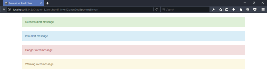
As seen different alert message shown in different color.
Bootstrap Jumbotron:
It is a special class that use to represent a big box with some information to catch user’s special attention to that information. For example consider the following code:
<!DOCTYPE html>
<html lang="en">
<head>
    <meta charset="UTF-8">
    <title>Use of Jumborton</title>
    <link rel="stylesheet" href="bootstrap.css">
</head>
<body>
<div class="container">
    <div class="jumbotron">
        <h1>Use of Jumborton</h1>
        <p>Here we can represent other related information</p>
    </div>
</div>
</body>
</html>
If we run this code we will have the following output:
As seen the Jumborton information is shown in big box to catch user attention.
Media Objects in Bootstrap:
It is a type of abstract class that use to build complex and iterative elements such as Facebook comments, blog comments and so on. Through it we can build hierarchy of components that either align left or right of their parent component. There are four type of media object default, nesting, alignment, and media list.
Bootstrap Panels:
It use represent contents such as text, image, link, table and so on, within a rounded corner box; that is, its act like a container. For example consider the following code:
<!DOCTYPE html>
<html lang="en">
<head>
    <meta charset="UTF-8">
    <title>Example of Panel use</title>
    <link rel="stylesheet" href="bootstrap.css">
</head>
<body>
<div class="container">
    <br>
    <div class="panel panel-default">
        <div class="panel-heading">
            Panel heading information
        </div>
        <div class="panel-body">
            Panel body can contains anything such text, image, table and so on.
        </div>
        <div class="panel-footer">
          <p>Give your desired footer contents</p>
        </div>
    </div>
</div>
</body>
</html>
Here we implement panel-default class. We can also use other available panel, such as .panel-primary, .panel-success, .panel-info, .panel-warning, or .panel-danger; to bring different rounded corner color box. If we run this code we will have the following output:
As seen through panel we can represent information with rounded corner box.
Bootstrap Well:
Though it we also represent information with rounded corner box but main difference between panel and well is that; the well does not have header and footer element like panel. We can make large and small well through related contextual well class such as: well well-lg, well well-sm.
Caraousel in Bootstrap:
In bootstrap through carousel class we implement sliding effect without using other third party JavaScript plugins and also required less coding to implement sliding effect as compared third party plugins.
Glyphicons:
In bootstrap glyphicons are used to represent small icons; although they look like image but glyphicons are lightweight font icons and not images. The main advantages of using glyphicons is; as they are font icons, their colors and sizes can be varied depending on display resolution.
Collapsing Elements:
In bootstrap the collapse plugin is also known as an accordion plugin. It is a plugin that contains multiple, vertically side by side tabs, but it can open only one tab at a time. The main advantages of using bootstrap collapsing elements is that; we do not have write single line of JavaScript code separately to implement collapsing; rather then we just we have to use html attribute and blocks of <div> element to implement collapsing.
More Bootstrap Interview Questions and Answers
How to create a dropdown menu in Bootstrap? Kindly give an example with complete source code?
In bootstrap we can create dropdown list with the help of dropdown class. To create a dropdown list, first we include the dropdown class through a <div> element. Secondly, within this <div> element we include <a> and <ul> element. The <ul> element is hidden by default and the <a> element use to toggle the <ul> element; that is dropdown menu. The data-toggle attribute of <a> element tells Bootstrap to show the <ul> element with dropdown effect whenever <a> is clicked. On the other hand, the data-target attribute of <a> is used to prevent the page redirection. Here we define the actual resource link with in <ul> element and it should have the class dropdown-menu. Consider the following piece of code.
The content of dropdownlist.html file:
<!DOCTYPE html>
<html lang="en">
<head>
    <meta charset="UTF-8">
    <title>Drop down List Example</title>
    <link rel="stylesheet" type="text/css" href="bootstrap.css">
    <script src="jquery.js"></script>
    <script src="bootstrap.js"></script>
</head>
<body>
<div class="container">
    <h1>Dropdown list example</h1>
    <div class="dropdown">
        <a data-toggle="dropdown" data-target="#">Dropdown <span class="caret"></span></a>
        <ul class="dropdown-menu">
            <li><a href="#">First link</a></li>
            <li><a href="#">Second link</a></li>
            <li><a href="#">Third link</a></li>
        </ul>
    </div>
</div>
</body>
</html>
[Note: Remember to put jquery.js, bootstrap.js, bootstrap.css and dropdownlist.html in the same folder].
If we run this code we will have the following output as: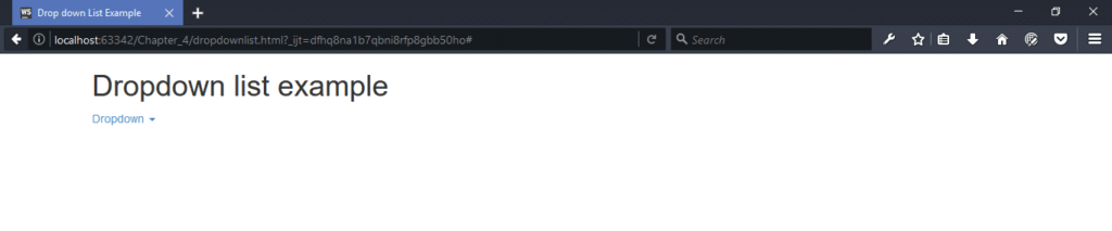
As seen the <ul> element is hidden. If we click on the Dropdown then the <ul> element will be shown as:
As seen all the <ul> element shown and if we click somewhere else on the page; then the <ul> element will again be hidden; that is how it represent the toggle behavior.
What is a bootstrap list group? And why to use it? Kindly explain its use with the help of an example.
Bootstrap list group is nothing but a CSS class that applied to <ul> element. Through list-group class we apply style of bootstrap to the <ul> element; it’s also help us to align elements within <ul> as well as help us to integrate and maintain consistence look with other elements of bootstrap. To create list group, we also need to apply list-group-item class to the <li> elements. The <li> element contains the actual content of list group. For example consider the following code:
<!DOCTYPE html>
<html lang="en">
<head>
    <meta charset="UTF-8">
    <title>Example of list group</title>
    <link rel="stylesheet" href="bootstrap.css">
</head>
<body>
    <div class="container">
        <br>
        <ul class="list-group">
            <li class="list-group-item">read mail number <span class="badge">14</span></li>
            <li class="list-group-item">unread mail number <span class="badge">4</span></li>
            <li class="list-group-item">todo list <span class="badge">7</span></li>
        </ul>
    </div>
</body>
</html>
As seen from the above code how we integrate badge class into <li> element. If we run this code we will have the following output: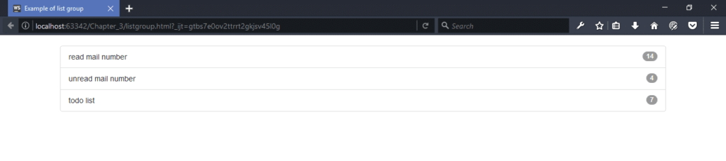
As seen from above how list-group class together with the list-group-item class help us to align <li> element as well as integrate other classes, as in this case we integrate badge class.
Back to Top
How to create a menu using navbar-inverse in Bootstrap?
In bootstrap navbar is a special class that allow us to implement navigation system in web page. It alone can do nothing; it work like an abstract class that allow other navigation related classes to implement specific type of navigation such as default navbar, navbar-inverse. The role of navbar is to change its content viewing process base on display device. It may collapses all it content and then view those content vertically if the display device width is small e.g. mobile device or view its content horizontally if the display device large enough. For example below code represent the inverse navigation bar.
Content of inversenavbar.html file:
<!DOCTYPE html>
<html lang="en">
<head>
    <meta charset="UTF-8">
    <title>Example of Inverse Navigation Bar</title>
    <link rel="stylesheet" href="bootstrap.css">
    <script src="jquery.js"></script>
    <script src="bootstrap.js"></script>
</head>
<body>
    <div class="container">
        <div class="navbar navbar-inverse">
                <div class="navbar-header">
                    <button type="button" class="navbar-toggle" data-toggle="collapse" data-target="#inverseNavBar">
                        <span class="icon-bar"></span>
                        <span class="icon-bar"></span>
                        <span class="icon-bar"></span>
                    </button>
                    <a class="navbar-brand" href="#">Default Navbar</a>
                </div>
                <div class="collapse navbar-collapse" id="inverseNavBar">
                    <ul class="nav navbar-nav">
                        <li class="active"><a href="#">Place holder 1</a></li>
                        <!-- drop down list -->
                        <li class="dropdown">
                            <a href="#" class="dropdown-toggle" data-toggle="dropdown">List place holder <b class="caret"></b></a>
                            <ul class="dropdown-menu">
                                <li><a href="#">List item1</a></li>
                                <li><a href="#">List item2</a></li>
                                <li><a href="#">List item3</a></li>
                                <li class="divider"></li>
                                <li><a href="#">List item4</a></li>
                                <li><a href="#">List item5</a></li>
                            </ul>
                        </li>
                        <li><a href="#">Place holder 2</a></li>
                        <li><a href="#">Place holder 3</a></li>
                        <li><a href="#">Place holder 4</a></li>
                    </ul>
                </div>
        </div>
    </div>
</body>
</html>
[Note: To run this code we must have to put inversenavbar.html, bootstrap.css, jquery.js, bootstrap.js file in same folder.]
As seen from the code navbar serve as an abstract class through it we implement inverse navigation bar with the help of navbar-inverse class. Here <div class=”navbar-header”> element contains <button> and <a> element. Then content of <a> element will be shown regardless of display size but the content of <button> will be shown when the display size is small. If the display size large enough; then content of <div class=”collapse navbar-collapse” id=”inverseNavBar”> will also be shown. But when the display size is small then <button> element will be shown alongside with the <a> content, but in this case button represent link to the <div class=”collapse navbar-collapse” id=”inverseNavBar”> element content. If we run this code in browser then we will get the following output as: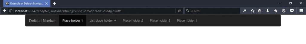
As seen because of large screen all content are displayed except content of <button>. But if we reduce the browser size then we will have the following output:
As seen now <button> are shown and if we click the button then will have the following output: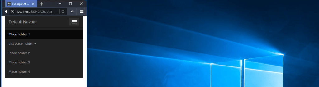
As seen the <button> element now hold the link of <div class=”collapse navbar-collapse” id=”inverseNavBar”> content. We implement this link through data-target=”#inverseNavBar” attribute of <button> with the id=”inverseNavBar” attribute of the place holder <div> element.
Back to Top
How to make an image responsive in Bootstrap? Kindly explain with code sample?
In bootstrap we make image responsive through .img-responsive class that applied to <img> element of HTML. The main advantage of using responsive image over non-responsive is that responsive maintain its height and width with the parent element that hold the image or with the display device size. Consider the following code of responsive image.
Content of responsiveImage.html file:
<!DOCTYPE html>
<html lang="en">
<head>
    <title>Example of Responsive Images</title>
    <link rel="stylesheet" href="bootstrap.css">
    <script src="jquery.js"></script>
    <script src="bootstrap.js"></script>
</head>
<body>
<div class="container">
    <h2>Non-Responsive Image</h2>
    <div>
        <img src="someImage.png" alt="Non Responsive Image">
    </div>
    <hr>
    <h2>Responsive Image</h2>
    <div>
        <img src="someImage.png" class="img-responsive" alt="Responsive Image">
    </div>
</div>
</body>
</html>
[Note: run this code we must put responsiveImage.html, bootstrap.css, jquery.js, bootstrap.js and someImage.png file in same folder].
If we run this we will have the following output:
In normal screen size, we can see both image without any image size distortion. Now if we reduce the browser size at certain level then we will have the following output as: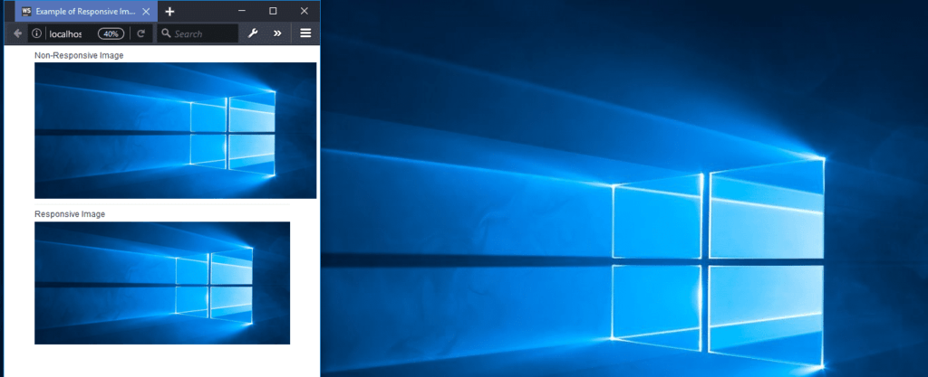
As seen above, the non-responsive image is not resized itself, on the other hand, the Responsive image resized itself. If we further reduce the browser size then we will have the following output: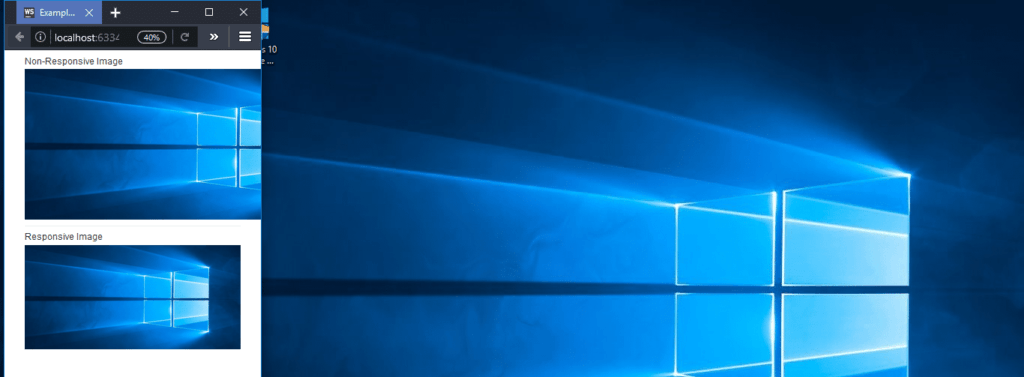
We can see now, non-responsive image is not fully visible but we still can see responsive image fully; because the responsive image always tries to maintains its size with respect to display screen size (in this case the browser).
Back to Top
Kindly explain the following bootstrap plugins? Modal, Scrollspy, Affix, Transition?
Modal: In bootstrap we can create modal dialog window with the help of modal class. Almost all modal windows has three part including header, body and footer; and by default all modal windows are hidden in web page until we specify a certain condition on which a specific modal window appear. We can implement all of those stuff by using bootstrap class as follow.
Content of modalwindow.html file:
<!DOCTYPE html> <html lang="en"> <head> <meta charset="UTF-8"> <title>Example of Modal Window</title> <link rel="stylesheet" type="text/css" href="bootstrap.css"> <script src="jquery.js"></script> <script src="bootstrap.js"></script> </head> <body> <div class="container"> <br> <h1>Example of Modal Window</h1> <div class="modal fade" id="linkToModalWindow"> <div class="modal-dialog"> <div class="modal-content"> <div class="modal-header"> <button type="button" class="close" data-dismiss="modal">×</button> <h4 class="modal-title">Put modal header title here</h4> </div> <div class="modal-body"> <p class="bg-primary">Put required information to the modal body</p> </div> <div class="modal-footer"> <button type="button" class="btn btn-primary">Apply Change</button> <button type="button" class="btn btn-default" data-dismiss="modal">Close</button> </div> </div> </div> </div> <p class="bg-info">Click the Button to launch the modal window</p> <button class="btn btn-primary" data-toggle="modal" data-target="#linkToModalWindow"> Launch Modal Window </button> </div> </body> </html>
[Note: To run this code we must put modalwindow.html, bootstrap.min.css, jquery.js, bootstrap.js file in same folder]
Here we first implement the modal class and to apply fading effect we also include the fade class; we set modal window id as id=”linkToModalWindow”; this first <div> element act as modal window container; since modal window is one type of dialog box so second <div> contains the class “modal-dialog”; Now within modal-dialoag <div> element we define modal-content <div> into which we define rest of modal window content such header, body and footer with help of modal-header, modal-body and modal-footer respectively; and to trigger the modal window, we define a button below the page and set its data-toggle attribute to modal and set data-target attribute to linkToModalWindow; to identify our desired modal window. So when we click the button the modal window get appear with fading effect as shown below: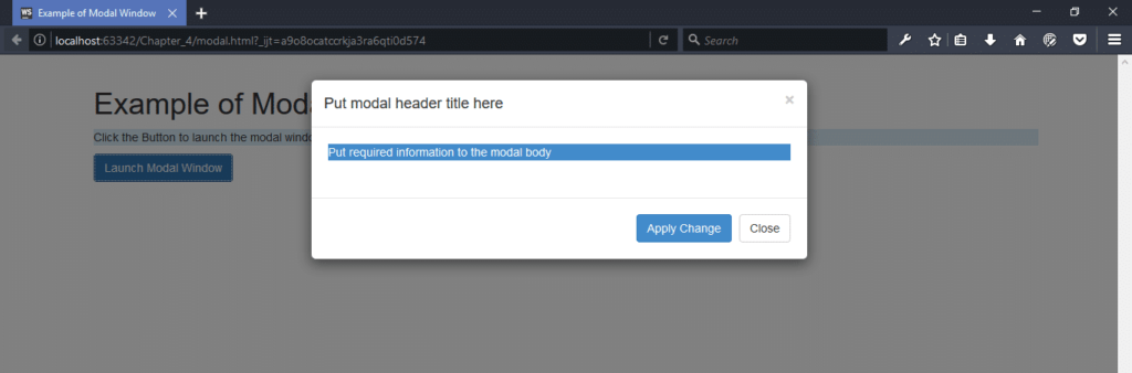
We can cancel the modal window either by clicking the X or Close button or by clicking anywhere else outside the modal window. Here Apply Change is a dummy button; have no action at all.
Scrollspy: It is a type of navigation system of web page that link page content to a page menu. That is, when we click certain menu item then the page automatically scroll down to the beginning of that specific page content. For example consider the following code.
Content of scrollspy.html file:
<!DOCTYPE html>
<html lang="en">
<head>
    <meta charset="UTF-8">
    <title>Example of Scrollspy</title>
    <link rel="stylesheet" type="text/css" href="bootstrap.css">
    <script src="jquery.js"></script>
    <script src="bootstrap.js"></script>
</head>
<body>
<div class="container">
    <!--navigation bar-->
    <nav id="scrollSpyExample" class="navbar navbar-default" role="navigation">
        <div class="container-fluid">
            <div class="navbar-header">
                <button class="navbar-toggle" type="button" data-toggle="collapse" data-target=".navbarLinks">
                    <span class="icon-bar"></span>
                    <span class="icon-bar"></span>
                    <span class="icon-bar"></span>
                </button>
                <a class="navbar-brand" href="#">ScrollSpy navigation</a>
            </div>
            <div class="collapse navbar-collapse navbarLinks">
                <ul class="nav navbar-nav">
                    <li class="active"><a href="#home">Home</a></li>
                    <li><a href="#service">Service</a></li>
                    <li><a href="#product">Product</a></li>
                    <li><a href="#contuctUs">Contact Us</a></li>
                </ul>
            </div>
        </div>
    </nav>

    <!--page content-->
    <div data-spy="scroll" data-target="#scrollSpyExample">
        <h3 id="Home">Home</h3>
        <p>Lorem ipsum dolor sit amet, consectetur adipisicing elit, sed do eiusmod tempor incididunt ut labore et dolore magna aliqua. Ut enim ad minim veniam, quis nostrud exercitation ullamco laboris nisi ut aliquip ex ea commodo consequat. Duis aute irure dolor in reprehenderit in voluptate velit esse cillum dolore eu fugiat nulla pariatur. Excepteur sint occaecat cupidatat non proident, sunt in culpa qui officia deserunt mollit anim id est laborum.</p>

        <h3 id="service">Service</h3>
        <p>Lorem ipsum dolor sit amet, consectetur adipisicing elit, sed do eiusmod tempor incididunt ut labore et dolore magna aliqua. Ut enim ad minim veniam, quis nostrud exercitation ullamco laboris nisi ut aliquip ex ea commodo consequat. Duis aute irure dolor in reprehenderit in voluptate velit esse cillum dolore eu fugiat nulla pariatur. Excepteur sint occaecat cupidatat non proident, sunt in culpa qui officia deserunt mollit anim id est laborum.</p>

        <h3 id="product">Product</h3>
        <p>Lorem ipsum dolor sit amet, consectetur adipisicing elit, sed do eiusmod tempor incididunt ut labore et dolore magna aliqua. Ut enim ad minim veniam, quis nostrud exercitation ullamco laboris nisi ut aliquip ex ea commodo consequat. Duis aute irure dolor in reprehenderit in voluptate velit esse cillum dolore eu fugiat nulla pariatur. Excepteur sint occaecat cupidatat non proident, sunt in culpa qui officia deserunt mollit anim id est laborum.</p>

        <h3 id="contuctUs">Contact Us</h3>
        <p>Lorem ipsum dolor sit amet, consectetur adipisicing elit, sed do eiusmod tempor incididunt ut labore et dolore magna aliqua. Ut enim ad minim veniam, quis nostrud exercitation ullamco laboris nisi ut aliquip ex ea commodo consequat. Duis aute irure dolor in reprehenderit in voluptate velit esse cillum dolore eu fugiat nulla pariatur. Excepteur sint occaecat cupidatat non proident, sunt in culpa qui officia deserunt mollit anim id est laborum.</p>
    </div>
</div>
</body>
</html>
[Note: To run this code we must put scrollspy.html, bootstrap.min.css, jquery.js, bootstrap.js file in same folder]
Here we first implement the navbar-default and set its id attribute value to scrollSpyExample. Next we define the <div> element that hold the page content with data-spy attribute to scroll and data-target attribute to scrollSpyExample. With the data-target attribute we linkup the default navigation bar with <div> element that have page content. Here we include some dummy content to test scroll spy navigation system. If we run the page in browser; and then reduce the vertical length of the browser window; then if we click any of the navigation link “Home”, “Service”, “Product”, and “Contact Us” then we will see that page automatically scroll down to that specific content as shown below: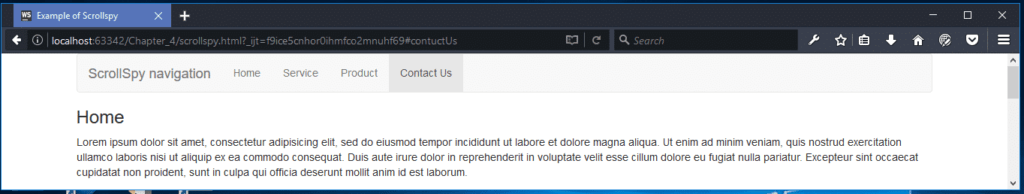 If we click on the Service of the navigation bar then the page will scroll down to service content as:
We make up this link through href attribute of <a> element from navigation bar to the id attribute of every <h3> elements those under the <div data-spy=”scroll” data-target=”#scrollSpyExample”> element.
Affix: Through affix we can fix a component position to a specific place of web page; that is the component will be fixed at that point all the time even scroll up or down the web page. This is usually used in navigation menus or social icon buttons, to make icon fixed at a specific area while scrolling up and down the page. For example consider the following code.
Content of affix.html file.
<!DOCTYPE html>
<html>
<head>
  <title>Affix Example</title>
  <link rel="stylesheet" href="bootstrap.min.css">
  <!--include the link of jquery-->
  <script src="jquery-3.1.1.min.js"></script>
  <script src="bootstrap.min.js"></script>
</head>
<body>

<div class="container jumbotron">
  <h1>Here we Jumbotron like as header component</h1>
  <p>This is Example of Using affix</p>
  <p>Here affix applied in navigation bar.</p>
</div>

<!--add some custom style sheet to navbar-->
<nav class="navbar navbar-default" data-spy="affix" style="top: 0px; width: 100%">
  <ul class="nav navbar-nav">
    <li class="active"><a href="#">Affix navigation</a></li>
    <li><a href="#">Home Page link</a></li>
    <li><a href="#">Service Page link</a></li>
    <li><a href="#">Product Page link</a></li>
  </ul>
</nav>

<div class="container">
  <h2>Plese input some text here </h2>
  <h2>Plese input some text here </h2>
  <h2>Plese input some text here </h2>
  <h2>Plese input some text here </h2>
  <h2>Plese input some text here </h2>
  <h2>Plese input some text here </h2>
  <h2>Plese input some text here </h2>
  <h2>Plese input some text here </h2>
  <h2>Plese input some text here </h2>
  <h2>Plese input some text here </h2>
  <h2>Plese input some text here </h2>
  <h2>Plese input some text here </h2>
  <h2>Plese input some text here </h2>
  <h2>Plese input some text here </h2>
  <h2>Plese input some text here </h2>
  <h2>Plese input some text here </h2>
  <h2>Plese input some text here </h2>
  <h2>Plese input some text here </h2>
  <h2>Plese input some text here </h2>
  <h2>Plese input some text here </h2>
  <h2>Plese input some text here </h2>
  <h2>Plese input some text here </h2>
  <h2>Plese input some text here </h2>
  <h2>Plese input some text here </h2>
</div>

</body>
</html>
[Note: To run this code we must put affix.html, bootstrap.min.css, jquery-3.1.1.min.js, bootstrap.min.js file in same folder]
As seen from the code here we apply affix to the default navigation bar through the data-spy attribute; here we also apply style so that the affix stick at top and use full width of the display device. If we run this code we will have the following output as: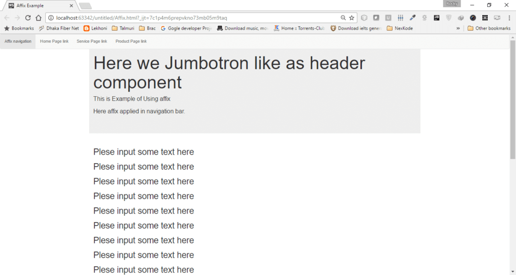
As seen the navigation bar is place at the top of the page. Now if we scroll down to see the page content below then we will have the following output:
As seen because of affix the navigation bar is fixed at the top; even other contents of the page move as we scroll down. If we further scroll down the page then then we will have the following output:
As seen the navigation bar still fixed at top.
Transition: This is just a bootstrap plugins that allow us to apply transition or fading effect to the other components of web page. For example because of this plugins the modal box, tab, alert, carousel panes show some short of transition or fading effect.
Back to Top
Following are the section details of this online course:
- Section 1: Getting Started With Bootstrap
- Section 2: Photo App Sales Website
- Section 3: Portfolio Resume Using SASS
- Section 4: Social Network Template
- Section 5: Agency Landing Page Using LESS
- Section 6: Photo Gallery
- Section 7: CMS Admin Template
- Section 8: Web Hosting Company Website
- Section 9: Ecommerce Template
- Section 10: Business Bootstrap Theme
- Section 11: Blog Website
- Section 12: Course Summary

Advanced Web Developer Interview Questions Series:
- Top 10 ASP.NET Web API Interview Questions
- Top 10 ASP.NET AJAX Interview Questions
- Top 10 WCF Interview Questions
- Comprehensive Series of WCF Interview Questions
- Top 10 HTML5 Interview Questions
- Top 10 ASP.NET Interview Questions
- Comprehensive Series of ASP.NET Interview Questions
- Top 10 ASP.NET MVC Interview Questions
- Advanced AngularJs Interview Questions
The post Top 15 Bootstrap Interview Questions – MUST HAVE appeared first on Web Development Tutorial.